Skip to content
Sparrow Computing
  • About
  • Blog
  • Schedule a Free Consultation

seaborn

The Quick Start Guide to Plotting Histograms in Seaborn

Ben Cook • Posted 2021-01-21 • Last updated 2021-10-21
October 21, 2021January 21, 2021 by Ben Cook
seaborn histogram with 2 colors

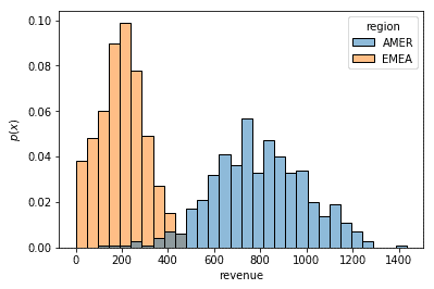
The histplot() function in Seaborn is a great API for plotting histograms to visualize the distribution of your Pandas columns.

Recent Posts

  • The Importance of High-Quality Labeled Data
  • Predictive Maintenance at General Electric
  • How to Label Data for Machine Learning
  • Understanding the Data Science Process for Entrepreneurs
  • Saving Utility Companies Years with Computer Vision
Sparrow Computing © 2025