
For many data visualizations in Python, Seaborn provides the best combination of a high-level API and nice looking plots. As of version 0.11.0, they have a great function for plotting histograms called histplot(). Let’s take a look.
Once you have your data in a DataFrame, plotting a basic, high quality histogram is a simple one-liner:
import pandas as pd
import seaborn as sns

df = pd.read_csv("https://jbencook.s3.amazonaws.com/data/dummy-sales-large.csv")

# Plot the histogram
sns.histplot(df, x="revenue")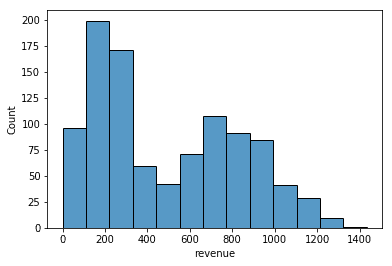
We just pass the DataFrame as the first positional argument and a column name for x.
One of the most important parameters for determining how well a histogram describes your data is the number of bins. Too many bins and you will see too much noise that looks like peaks, too few bins and you won’t be able to see the shape of your distribution. You can change this number with the bins argument
As a rule of thumb, I usually try bins=50:
sns.histplot(df, x="revenue", bins=50)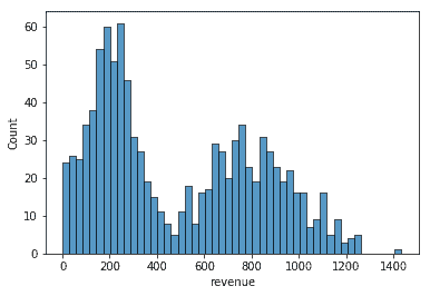
Then, I back off a bit if it looks too noisy. Let’s try bins=30:
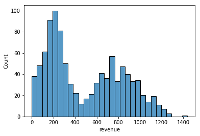
Much better! Another thing you might want to do with your histogram is convert the y-axis to the empirical probability so that it better represents the underlying distribution. You can make this change by passing in stat="probability":
ax = sns.histplot(df, x="revenue", bins=30, stat="probability")
ax.set(ylabel="$p(x)$")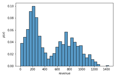
Notice we can also change the y-label. We do this by calling the set() method on the Matplotlib AxesSubplot object that Seaborn returns.
Finally, you sometimes want to see multiple distributions in the same plot. If your Pandas DataFrame is in long format, you can do this by passing in a categorical column to the hue argument:
ax = sns.histplot(df, x="revenue", bins=30, stat="probability", hue="region")
ax.set(ylabel="$p(x)$")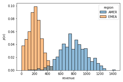
You can see how I generated this dataset and the rest of the code for this post in my Jupyter notebook!